Color Psychology: How to choose the right palette for your brand
Posted in Graphic Design, Uncategorized on
Colors are more than just visual appeal—they shape emotions, influence perceptions, and drive customer actions. But choosing the wrong color scheme can confuse your audience or even send the wrong message.
Let’s explore how color psychology plays a role in branding and marketing.
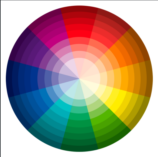
The Science of Color Psychology
Warm Colors (Red, Orange, Yellow): Energetic, passionate, and attention-grabbing. Often used in fast food, sales, and entertainment industries.
Cool Colors (Blue, Green, Purple): Calming, trustworthy, and professional. Popular in finance, healthcare, and technology.
Neutral Colors (Black, White, Gray, Beige): Sophisticated, minimalist, and timeless. Frequently used in luxury brands and corporate identities.
How to Choose the Right Colors for Your Brand
Understand Your Brand Personality – Are you fun and youthful or professional and serious?
Know Your Audience – What emotions do you want your customers to feel?
Consider Industry Standards – Certain industries tend to use specific colors (e.g., blue for tech and finance, green for wellness and sustainability).
| Good Example ✅ Coca-Cola’s red evokes excitement and energy, perfect for a beverage brand. | Bad Example ❌ A wellness brand using harsh, neon colors that don’t align with relaxation and health. |
For the nerds out there, our own brand, Source Brand Solutions, chose purples for our brand colors.
Like you read above, this can evoke feelings of professionalism and trustworthiness. We selected warmer-tone purples, leaving in that energy and passion that we have for your marketing.
Your brand colors can make or break your visual identity. Choose them wisely to ensure they align with your message and audience.