Design Disasters: 5 common graphic design mistakes that hurt your brand
Posted in Graphic Design on
First impressions matter, and bad design can drive customers away before they even read your message. Whether it’s a cluttered layout, poor typography, or inconsistent branding, these mistakes can make your business look unprofessional and unreliable.
Let’s explore five common design pitfalls and how to fix them. (Plus, we’ve got examples!)
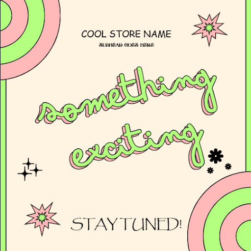
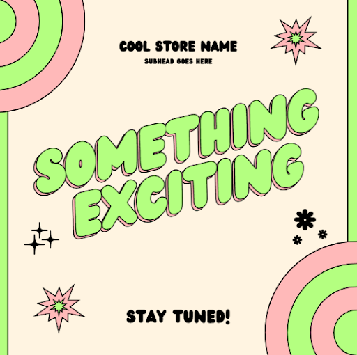
Overcrowded Layouts
The Mistake: Trying to fit too much information in one space makes your design overwhelming and unreadable.

The Fix: Use negative, or empty, space strategically to guide the viewer’s eye and create a clean, organized layout.

Poor Font Choices
The Mistake: Mixing too many fonts, using unreadable typefaces, or defaulting to overused fonts like Comic Sans or Papyrus.
The Fix: Stick to two or three complementary fonts that align with your brand’s personality. Prioritize readability.
Inconsistent Branding
The Mistake: Using different colors, fonts, or styles across platforms leads to brand confusion.
The Fix: Develop a brand style guide and use consistent design elements across all marketing materials. Check out style guides on our portfolio.
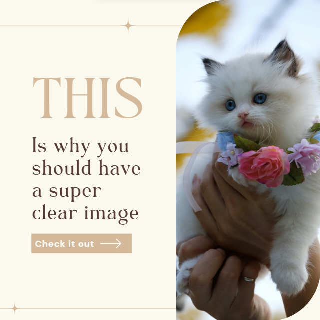
Low-Quality Images
The Mistake: Pixelated, stretched, or irrelevant stock photos make your brand look cheap.
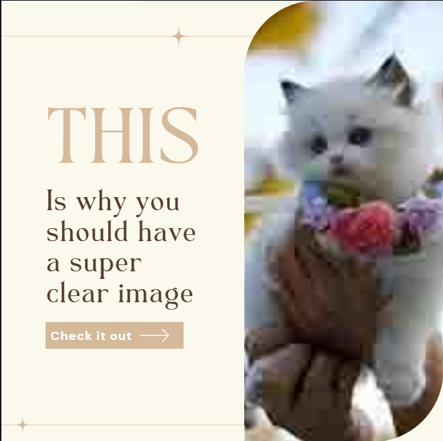
The Fix: Invest in high-quality, original photography or reputable stock photo sources.
Ignoring Mobile Optimization
The Mistake: Designing graphics that don’t adapt well to mobile devices leads to a poor user experience.
The Fix: Test designs on multiple devices and use responsive design principles.
Your brand’s credibility depends on professional and polished visuals. Avoid these common mistakes, and your design will work for your business, not against it. Check out our portfolio!